A few years ago, I was interested in typography and learned the book “Designing Type“ of Karen Cheng.

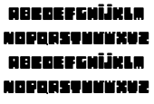
Then, in February 2009, I conceived a fat font with a low readability. I like when concept comes after the form. A title font that could be used as a form with images inside.
A simple principle : a rounded rectangle with small rounded rectangles removed (actually the smallest possible).
Drawings, designing until uniformity, a satisfying grey, and enough readability.
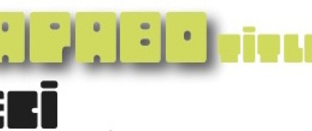
This was my first font. The name “Sapabo” came from my son (3 years old) who said ça pas beau (this not cute). And title to specify that this is not a text reading font...
A test poster there
A poster showing various heights there
Download the ttf font (use download as...) there
