
June the 1st 2022. I have published on HAL a research report,
Title: "Importance Driven Color Assignment"
Subtitle: "Importance Driven Color-Group Assignment in Categorical Visualization"
on my latest work about assigning colors to classes for categorical data visualizations.
The pdf file is downloadable (use save as) here
In categorical data visualizations, different values are usually identified by different colors. Finding both the colors to use and what values to associate them with is complicated, but publications exist on this question.
I believe that "data scientists" have preferences about the color palettes to use for categorical data visualizations. For this reason and because it reduces the search space, the presented work uses a color palette provided by the visualization designer. If there are n categories, the user provides the palette containing n colors. All that "remains" then is to find which category to associate each color with.
The problem is still complicated (NP-complete), for n colors there are factorial n assignment possibilities.
n! = 1x2x3x4x...x(n-2)x(n-1)x(n)
These assignments may be seen as permutations. For example, for 3 colors, there are 1x2x3=6 ways to assign them to values: (1,2,3)(1,3, 2)(2,1,3)(2,3,1)(3,1,2)(3,2,1)
To find a solution, past small values such as n<8, it takes too long to try all the permutations (for 10 categories, the number of permutations is 3,628,800). We must therefore try to find a satisfactory solution by heuristic methods.
To model the problem, we devise an energy function (fitness) which takes as input parameters to be tested, and therefore for this problem, a permutation as parameter. This energy function must return a value that is all the greater that the solution described by the parameters is satisfactory.
To build this function, I use two symmetric square matrices.
Color Distance Matrix
The first matrix is the "color distance matrix", which contains the n x n distances between palette colors. It is independent of the data.
The element i,j of the color matrix therefore contains the result of the color distance DE2000 (elaborated by the CIE) between the two colors Ci and Cj of the palette. The value is independent of the data and independent of the type of visualization.

Importance Matrix
The second matrix (size n x n) is called "importance matrix" which codes the importance of having a high color contrast between two classes of the visualization (i.e. between two graphical objects representing classes, or two sets of objects representing the two classes). It is independent of the palette's colors.
The i,j element of the importance matrix contains the need for color contrast between the two (or sets of) objects in the visualization that represent the categories i and j . The value of this element is independent of the colors, but dependent on the type of visualization and the data represented. For example, if two graphical objects are neighbors and of small sizes, the need for color contrast will be high so as not to confuse the two categories if similar colors are assigned to them (spreading).

Success of a color assignment
We express the individual success of a color assignment p to a class q by the product of the two elements p,q of the two matrices. To handle the color permutation, the color matrix is permuted according to the permutation to be tested.
For a permutation, we express the energy by summing the elementary successes of the color assignments which is the sum of the products of the matrices' elements. This matrix product is called internal product or Frobenius product.
Optimization
A genetic optimization algorithm provides an approximate solution in the form of a permutation for which the calculated energy is the highest. The resulting permutation is optimizing the class-color assignment in the case of color contrast.
Application
To apply the concept, dedicated visualization importance formulas must be designed in order to evaluate the need for contrast between categorical classes.
Some proposed importance formulas applications of the concept to types of visualization are given in the report: streamgraph, chord diagram, polygonal map, line charts. The resulting color assignment diagrams are shown compared to random assignments and diagrams using directly the color palette.
By a click on the image, a pdf file can be visualized.
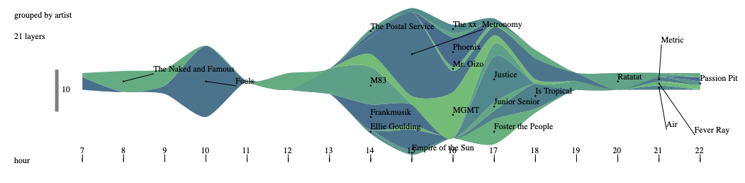
Visualization in "Streamgraph", on music listening data (Musimorphose project) with our class-color assignment.
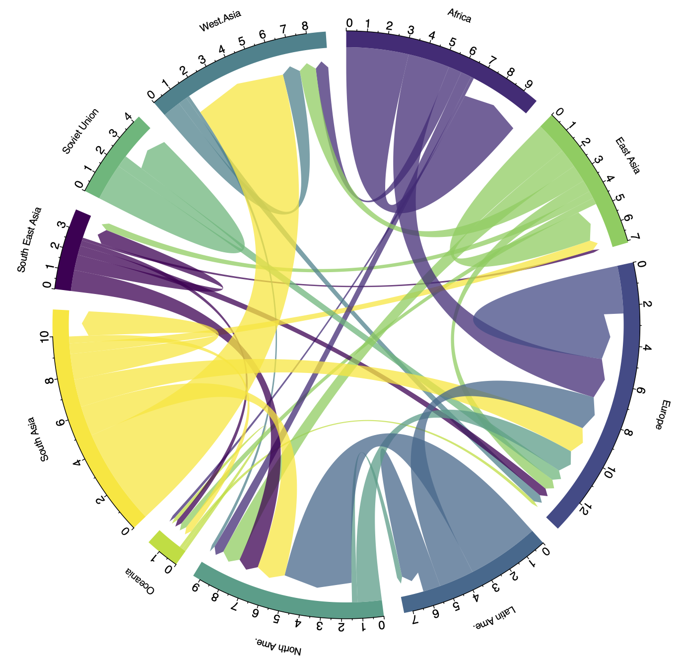
Visualization in "Chord diagram", from www.data-to-viz.com (many thanks to Yan Holtz), with our class-color assignment.
Visualization of categories in polygonal map, with our class-color assignment ( package R spdep ).
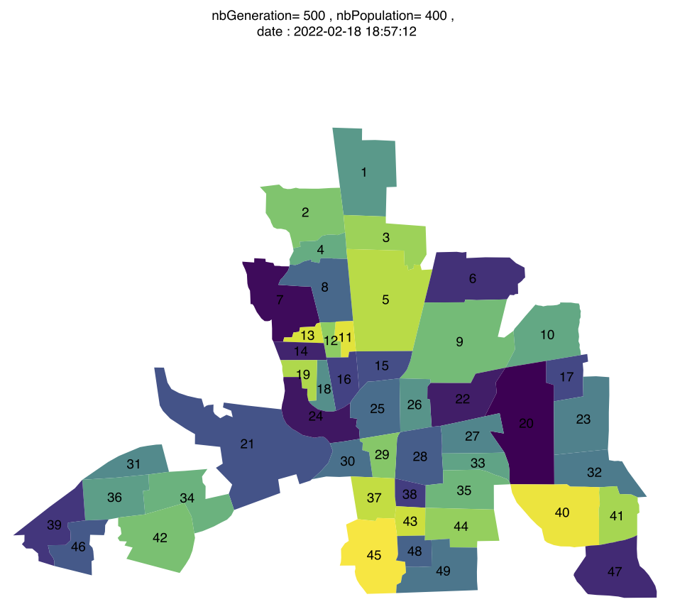
Colombus map